Throughout its illustrious history, the National Association of Student Councils (NASC) has undergone a transformative journey, mirroring the evolving aspirations of student leaders across generations. Our brand evolution is a testimony to NASC’s rich legacy and commitment to shaping the leaders of tomorrow.
1931
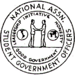
A Vision is Born
In the nascent days of NASC, the inaugural logo was a round seal that bore the name “National Association of Student Government Officers.” It depicted symbols of international cooperation and stood for the core values of Leadership, Initiative, Honesty, and Good Government. This seal was a testament to the visionary student leaders who believed in amplifying student voices for positive change.
1937
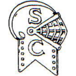
The Knight’s Call
As the organization’s identity took shape, a logo featuring a knight’s helmet emerged. The letters “S” and “C” adorned the helmet, symbolizing the essence of Student Council leadership. This emblem embodied the chivalrous spirit of student leaders committed to serving their communities.
1943
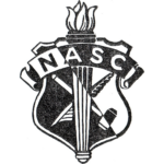
Torch of Transformation
In a significant transition, NASC introduced a shield logo in 1943, incorporating the torch imagery associated with the National Association of Secondary School Principals (NASSP), which had just become its parent organization. The emblem displayed a gavel and a pen, signifying the power of advocacy and the written word in driving change.
1947
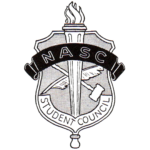
Strengthened in Unity
n 1947, the shield logo evolved to include “Student Council” across its base. This modification reinforced the commitment to unity and collaboration among student council leaders and state student council associations, standing as NASC’s beacon for 34 years.
1981
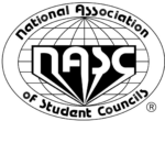
Celebrating 50 Years
A new logo was developed to celebrate NASC’s 50th anniversary, embracing an oval world-map style featuring the organization’s full name and the initials NASC. Founder Warren Shull was on hand for the celebration.
2007
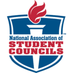
The Torch Rekindled
2007 marked a return to the torch and flame imagery from the 1943 logo. Red, white, and blue were established as NASC’s official colors, embodying the spirit of leadership, unity, and patriotism. The full name of the organization was prominently featured, guiding student leaders for a decade.
2017
Embracing Change
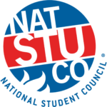
With a change in name to the National Student Council (NatStuCo), NASC adopted a circular logo with a partial flame, preserving the colors of the 2007 rebrand.
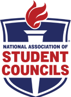
2024
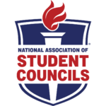
Honoring Our Legacy, Building Our Future
Following an extensive two-year program audit, the organization’s name was restored to the National Association of Student Councils, the name that had been proudly held for 77 years of its remarkable history. The new logo takes inspiration from the 2007 version while seamlessly blending in the elongated shield design reminiscent of the original 1943 concept. Modernized fonts and updated colors signify our commitment to both tradition and innovation, ensuring NASC remains the guiding light for 21st-century student leaders.
“Few lessons in the educational process are more important than those you learn as student leaders. Few experiences are more gratifying than the familiarity you have gained with the spirit and method of democracy. Today your leadership enriches the school you attend. Tomorrow it will enrich all the communities of our land.”
— President Lyndon B. Johnson